

Smart Transportation
Metropia is a Mobility-as-a-Service (MaaS) transportation app. It was created by Dr. Yi‑Chang Chiu, a former professor at the University of Arizona, and started as an academic project. After several years, Dr. Chiu worked with governments in Texas and Taiwan to bring the product into everyday use.
MaaS (Mobility‑as‑a‑Service) combines cloud computing, AI, big data, and other technologies. Many governments and companies see it as a key part of future smart transportation.
Before joining this team, I drove almost every day after getting my license about 10 years ago. When I drove, I relied heavily on map and navigation apps. In Taiwan, Google Maps is widely used and almost dominates the market. Instead of trying to “replace” it, our goal was to build something different—and better in some key moments.
With support from the government, Metropia could access more traffic data and run more advanced analysis. As the first and second in‑house designers, my team lead Yun‑Ting and I introduced design thinking and a more professional design process to the team. After we joined, we produced our first competitor analysis report, traffic design report, and annual design summary report.
Project – Navigation instruction text optimization
I joined several projects at Metropia, but one that stood out was improving the navigation instructions.
This was one of the features we used to differentiate from Google Maps. We wanted clearer logic and more thoughtful wording. We reviewed the instruction logic from our transportation data and worked on the details for months, with one goal: help people get to their destination with instructions that feel clear and trustworthy.
*Any screenshots and design analysis were from 2021. (I will add images and captions later.)
Problems
At that time, we found these pain points:
- People couldn’t easily understand which road or direction they were currently on.
- The top instruction was confusing: was it for the current road, or the next turn?
- People needed to see the next step and the step after that, especially when the two turns were close together.
- The instruction icons were hard to understand while driving.
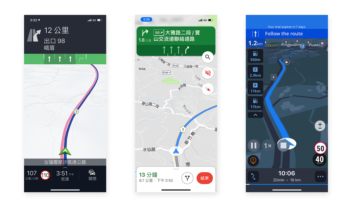
・Reference app: Others/Google/Sygic
What we did
Problem 1: “Where am I now?”
We added a “current road” text label under the current location marker (which moves while driving). We referenced a similar pattern from another app. This was easier for developers to implement and helped users understand their current position quickly.
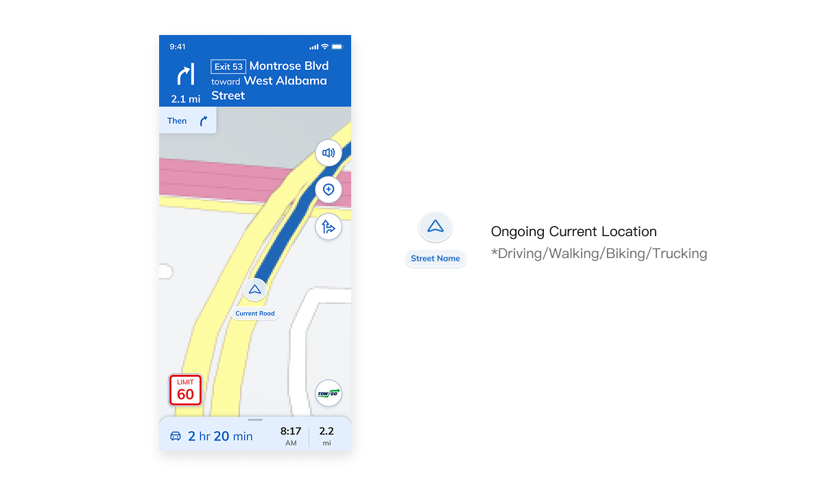
・Add information of current location
Problem 2: “What does this instruction mean?”
We realized wording details mattered. Instead of showing only a road name like “Hollywood Way,” we used action-based text such as “Head to Hollywood Way.” When the driver got close to the turn, we changed it to more specific wording like “Turn right onto Hollywood Way.”

・More details for instructions
Problem 3: “I need to prepare for the next two steps.”
We added one more instruction area to show the next step under the current instruction. This small change helped users feel more confident, especially when two turns were close together.
Problem 4: “Icons are unclear.”
We reviewed all available icon options and documentation. The team also worked closely with developers to validate the instruction data in a beta build, checking whether the icons matched the real driving situations.
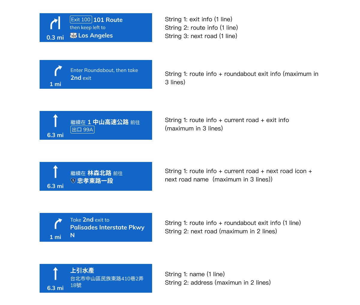
・Instructions logics
Conclusion
After the update, our CEO and the PM lead shared positive feedback with the design team. This was a well-known problem and also a hard one, because the navigation service had existed for years. I was glad that we identified the issue and got time to work with developers to improve it.
We couldn’t perfect every edge case due to the schedule, but it was still meaningful to move the experience from “usable” to “almost complete.”
This project also reminded me how much I enjoy solving real problems by combining product thinking with daily-life experience (like driving), and applying design skills in a practical way.