

New top page of banking app
Background
During the three years following the bank launch, we identified many problems and misalignments between users and the business department (external vs. internal perspectives). We continuously collected these issues throughout our day-to-day project work. In 2024, we finally had the chance to sit down, review everything we had encountered, and align on what we expected for the future.
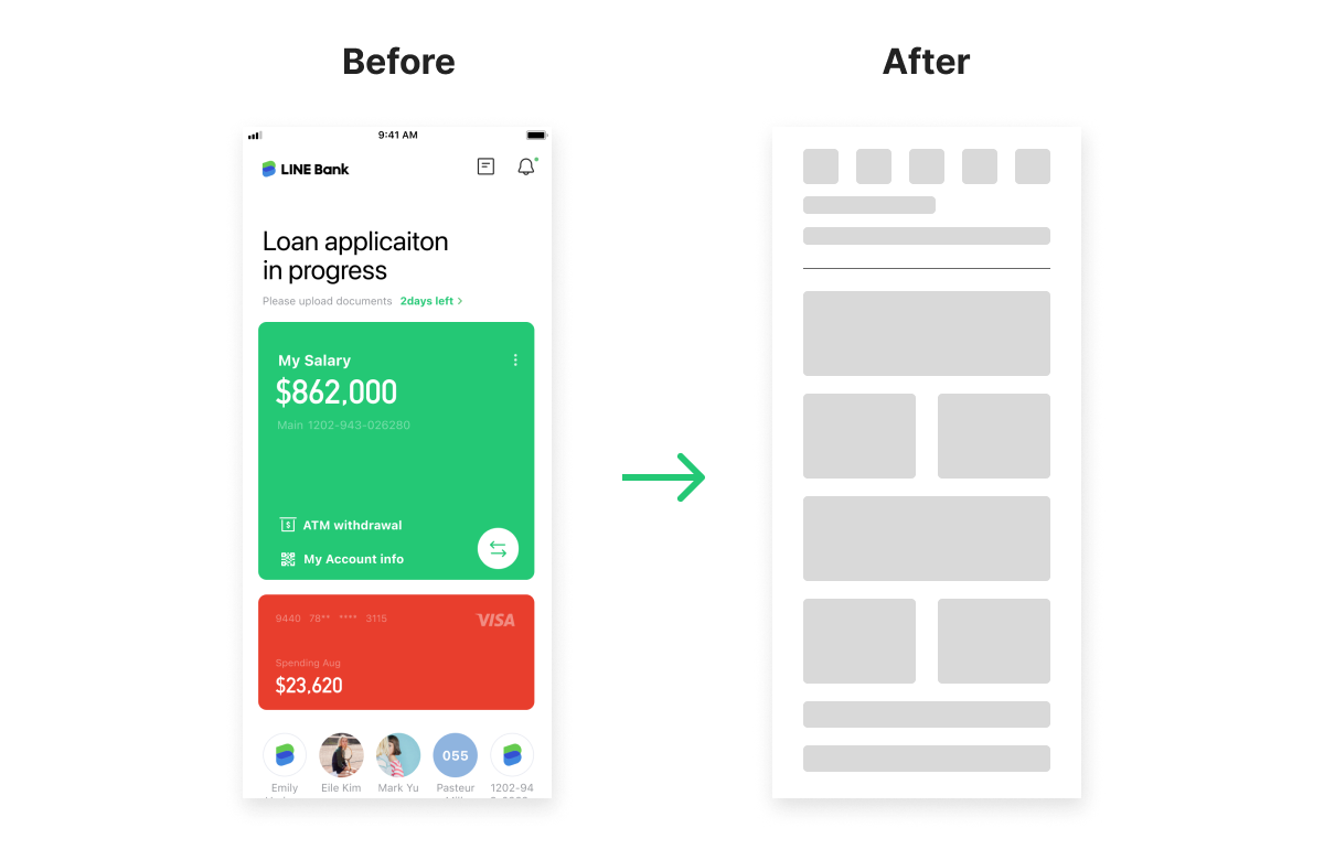
What we plan?
After discussions and meetings with C-level stakeholders, we decided to officially kick off this revamp project. We requested the resources and data we needed from leadership, and we planned the following steps for the project from the beginning:
Step 1. Research
Step 2. Define questions and targets
Step 3. Design concept
Step 4. Check feasibility (development and business) based on the design concept
Step 5. Design flows and screens
Step 6. Confirm the development schedule and start development
Step 7. Development and testing
Step 8. Internal rehearsal and beta testing
Step 9. Launch
Step 1. Research
Based on the plan above, we started with design research. After internal discussions within the design team, we identified several key topics:
- User data (for issues we were unsure about)
- Internal workshop (to understand which topics each team cares about most)
- Competitive analysis (banking/financial apps)
User data
Because data tracking was not planned from the start, we quickly realized we didn’t have as much data as we expected from the bank’s launch. We only had screen views and a limited number of click events in our database. We asked the data team and developers to help improve tracking, and we set a one-month goal to produce the first report.
After one month, we received the baseline data we needed, and we learned:
(1) Some assumptions and worries were not actually true. Before seeing the data, we assumed the current design forced users to spend a long time scrolling. However, the data showed that most LINE Bank users have no more than three accounts.
(2) Users can still find their way even if it isn’t the most convenient path. We believed (and later confirmed through data) that we should solve the problem of users not being able to enter product or account pages quickly. However, we also found that users had adapted by tapping the bottom cards after trying a few paths. This raised another question: should we preserve this user habit, even though it wasn’t our original intention?
Internal workshop
We realized that not only user feedback but also internal teams’ perspectives are critical for this product. That’s why we held a workshop and invited people from different teams, including system, business strategy, finance, legal, development, and C-level stakeholders.
We prepared four questions for participants to encourage deeper discussion:
(1) Three pain points you encountered while using the app.
(2) Three pain points you encountered while working on the app.
(3) Any banking apps you like besides ours, and why?
(4) If you were the owner of the revamp project, what topics would you add?
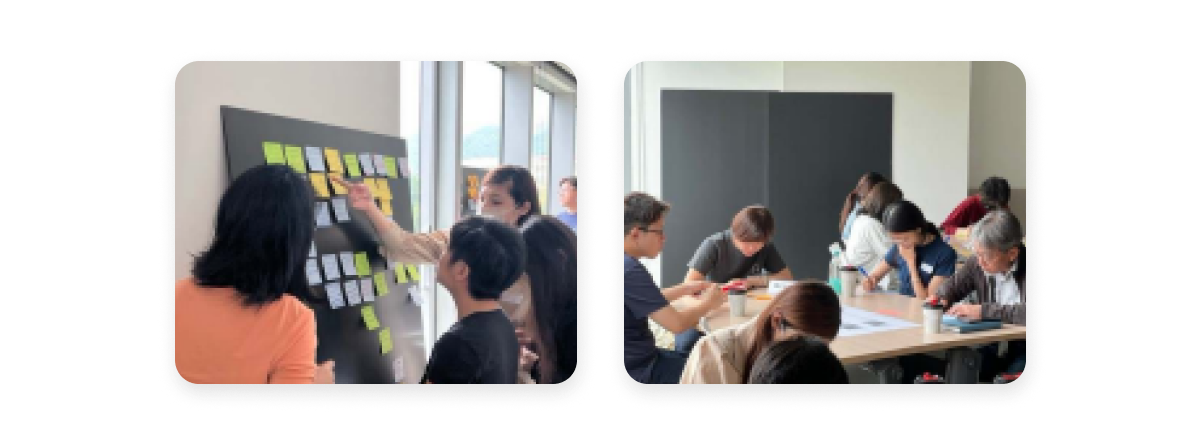
・in workshop
Competitive analysis
As a digital-only bank in Taiwan, there are not many direct competitors we can reference. However, we could still learn from specific features in banking apps from other countries where the fintech industry has been more mature for longer—such as South Korea, the UK, and Hong Kong.
After collecting and organizing screenshots and information, we summarized objective features and common functions in our analysis report. It is also worth mentioning that our KR designers produced a document on the same topics around the same time. It was valuable to have two reports focused on the same target, but from different perspectives.
Here are a few points that are especially worth sharing:
A. Different cultures lead to different design decisions:
(1) Showing or hiding balances is an important and common feature for TW users because people often prefer to maintain privacy in public. In South Korea and some other countries, this feature is not commonly included everywhere in banking apps.
(2) In Taiwan, many users switch their primary bank based on which account their salary is paid into, which is usually determined by their employer. This means users often do not choose the bank with the best user experience or convenience; instead, they adapt to the bank chosen by their company. The question is: how can we break this habit to attract more users?
B. Fintech development is constrained by financial regulations:
– To address the “salary account” issue, South Korea and the UK have solutions that allow multiple bank accounts to be synced and managed within a single banking app. For example, even if you open an account at Bank B, you can transfer, manage, and view it from Bank A’s app. In daily life, you can use just one app to manage your finances. However, due to Taiwan’s regulations and market competition, we cannot offer this service at the moment. Even though we understand the solution, we can clearly see this unavoidable gap between what TW users could benefit from and what we can legally provide right now.
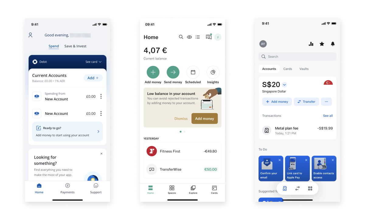
・Reference app: Chase UK/N26/Revolut
Step 2. Define questions and targets
After the research phase, we defined clear project goals to keep the team aligned and to make sure we stayed on track from kickoff to launch.
The questions and targets we finalized were:
(1) Address feedback from both users and stakeholders.
(2) Preserve existing strong features—and make them better and more robust.
(3) Use design to solve system-level problems, such as reducing API calls and improving loading performance.
Step 3. Design concept
This was the phase we spent the most time on (up until I left the project). Based on the research and internal requirements, we realized it would be challenging to balance the needs of users, stakeholders, the system, and leadership.
To move forward, we brought the key questions to C-level stakeholders and aligned on what should be prioritized first. We also set a clear timeline for the revamp—not only the launch target, but also how long we expected it to take after launch to reach a stable, fully available state.
*Due to the confidentiality agreement, I can’t share the designs or detailed information from this point onward.
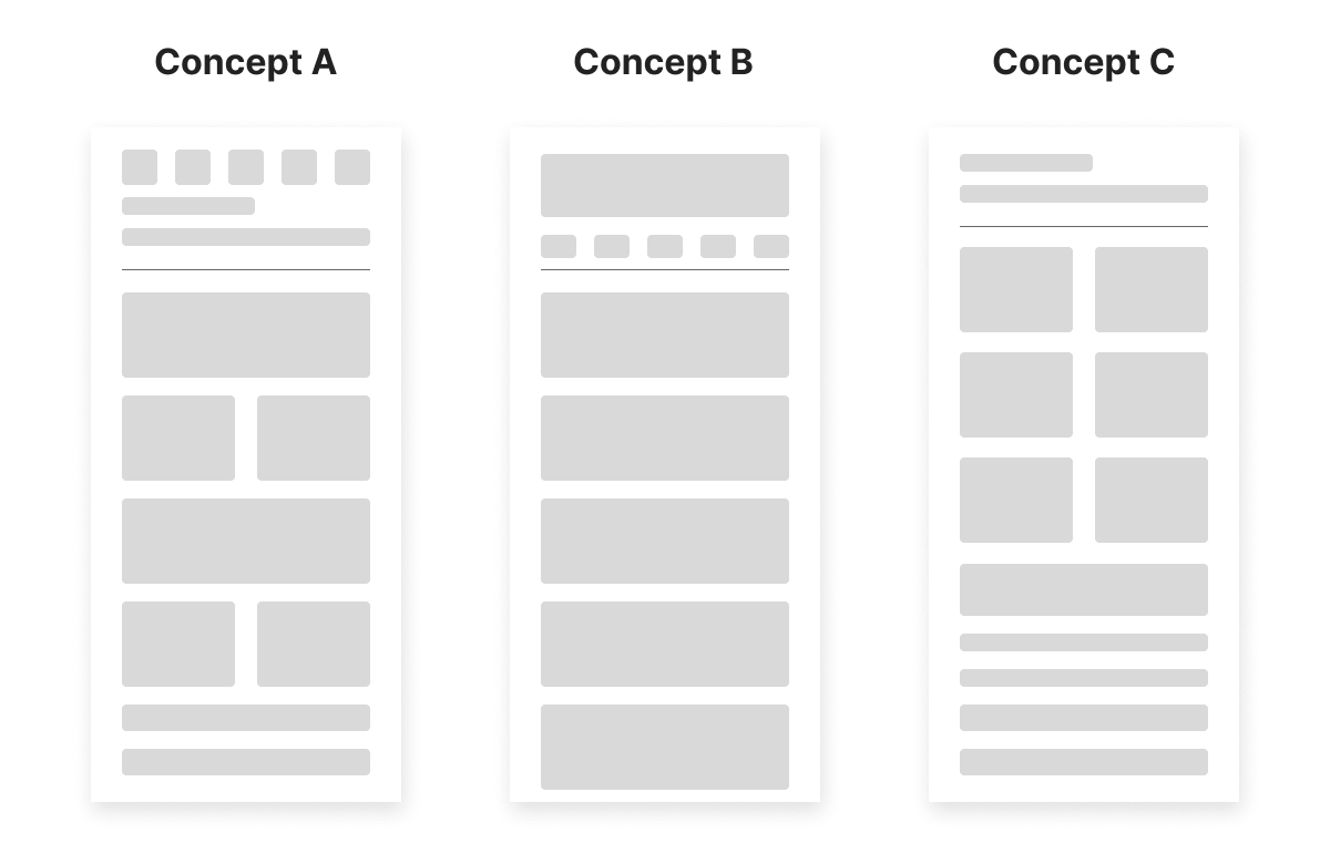
・Deliver different concepts based on different constructions
Notes
I didn’t get the chance to check the final product before I left the project. Still, there are a few key lessons I took away and a couple of expectations I have for the revamp.
What I learned
(1) Even with a clear target, different stakeholders (and even different user segments) may have different priorities. A good product designer doesn’t only produce user-centered designs—they also listen carefully to business, marketing, system constraints, and user needs, and help the team find a workable balance.
(2) When you work on the most important (and most visible) screen, you quickly realize how many trade-offs and problems come with it. I learned the importance of aligning stakeholders early, helping them find common ground before moving forward, and bringing everyone with different opinions into the same conversation to clarify priorities.
(3) Even with an existing design language and component library, there are many moments where you need to decide whether to extend existing components or introduce new ones. These decisions are especially difficult when other projects are running in parallel—because a small choice today can have long-term impact years later.
What I expect
(1) The team can achieve the goals we set and successfully ship the revamp.
(2) The revamp reduces the key problems as much as possible and becomes a strong reference for the design team—so future projects of a similar scale can be planned and executed more effectively.